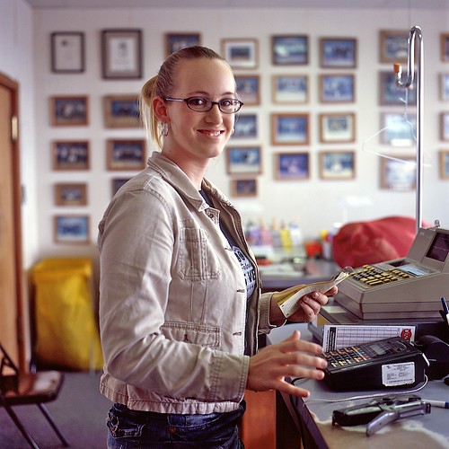
This is the first in a series of unsolicited photo critiques (see introduction).
This photo, Jessica, Tomsu Cleaners, is by Dan Loflin. I love this guy’s work, and he’s made heaps of other interesting images, but this is a recent one that grabbed me.
Take a good, long look. This one’s better if you let it unfold yourself.
(Paraphrasing and expanding on the comment I left on the photo on Flickr:)
What I love about this is that it’s creeper weird. I look at it for a while. I see a pretty normal-looking scene, though it’s something you’re more likely to see in person rather than in a photo.
Great lighting.
There’s something a little uncomfortable about the framing. My eye wants to see the camera moved a bit to the right to eliminate the door frame and include the rest of the cash register. Then I’m glad he didn’t do that, because the subtle tension makes it feels like a real, active space that forces me to take in the whole thing rather than allowing me to snap to an immediate and pat parsing of "woman, cash register", making a bunch of assumptions, and walking away.
Great depth of field choice, it really complements the framing by letting each the foreground and background play their parts.
Then it starts to dawn on me: there’s an undercurrent here, a vaguely unsettling but quickly growing feeling. Then it’s a frying pan to the face. I really see her hands for the first time. They’re acting out their own fitful play while the rest of her is trying to go about her business. She seems interrupted, good-humored and maybe a little self-conscious, but her hands seem undeterred. It seems like Loflin’s given us a window into a long continuum of conflict and looks like a disturbingly precise portrait of functional OCD.
To me, this is a very understated but incredibly powerful decisive moment. It’s not necessarily immediately accessible—it wasn’t to me, anyway—but I think that’s part of this photo’s strength. I like art that makes me work for it a little and participate.
In music, there’s the concept of an "envelope", which describes the shape of a sound, and is broken into four components: attack (how quickly a sound reaches its full volume), decay (how much quieter it gets over how long a period), sustain (how long that quieter bit maintains a plateau level), and release (how quickly it fades out). The same applies to flavors in cooking and the emotional experience of looking at art for me. Not something to be quantitatively evaluated and used to judge work, but I’ve found it to be a useful framework for describing the rides, or plot arcs, that these things take me on.
Some photos, mostly those that rely on an effect over actual substance, give it all up too quickly. OK, you cross processed it, shot it with a pinhole or a Lomo, have a really shallow or huge depth of field, have a great tonal range, made a cyanotype, whatever, it makes an immediate and striking impression. But if you’re not saying or creating anything with that stuff beyond the effect, you’ve got nothing left after half a second. It grabs your attention but then doesn’t do anything with it. This is why de-fatted foods taste like shit: fat masks flavor and spreads its release out over a longer period of time. Without the fat, all the flavor compounds are released and processed right at the beginning, giving you a fast initial hit but leaving you a mouthful of tasteless crap to deal with.
There’s no flavorless crap in this photo. It draws me in with good compositional decisions, hintingly unfolds a little, ramps up quickly, punches me in the face, lets me hang out for a minute to put it all together, and then fades out, like having your head inside a struck bell that never quite stops vibrating. Chewing satisfaction goes on and on.
You can see more of Dan’s work at his Web site, DanLoflin.com, and in his photostream on Flickr.

Nice critique. You did a good job of explaining the not-so-obvious appeal of the picture. I hope to see more.
i hope the photo punched you hard.
grandiose review of a regular photo.
liked your language & adjectives.. albeit unsuitable for this picture
you really pushed the envelope on the your critique – not sure the photo kept up though…
Good critique. I like how her head seems so separate from the background, while her hands are so attached to the environment. I wouldn’t say the pictures perfect, but it is pretty close!
Excellent photo. Very insightful, Nicolai.
I think I see what you mean about the tension created by partially framing the door and the cash register… but to me the true tension comes from the fact that she’s reaching for that hand stapler in order to shoot Dan in the face. “That’s it, keep pointing the camera at me, photo-boy. Don’t pay any attention to my right hand. That’s it, look at my boobs, and… BAM! Leeeroy Jenkkkiiiinnnnnsssssss!”
Can I get a number crunch, 133r0y?
Seriously, Nick, everyone here including you is probably right about this one. It’s spooky how dead-on you are about the conditions under which this photo was taken and I’m flattered that you felt so compelled to write about it. It’s an honor, truly, to receive this sort of commentary from an incomparable person as yourself.
keep up the unsolicited critiques… i can already tell it’s going to be an awesome feature.
d
Awesome, man