Kodak Monographs now available for free download

These three Kodak publications are available as PDF downloads from archive.org. As you can see, they’re quite old, and the copyright has expired.

Kodak Monograph 1: The silver bromide grain of photographic emulsions, Adrian Peter Herman Trivelli (1921)

Kodak Monograph 2: The theory of development, Adolph H. Nietz (1922)

The Photographic Negative, William Henry Burbank (1888)

Written as a practical guide to the preparation of sensitive surfaces by the calotype, albumen, collodion, and gelatin processes, on glass and paper, with supplementary chapters on development, etc.

Photographic printing methods: a practical guide to the professional and amateur worker, William Henry Burbank (1891) (thanks, Glenn!)

Via APUG member Emulsion
MAGNAchrom magazine issue #5 is up: night photography

FINALLY! The 5th issue of MAGNAchrom is ready for you to download at www.magnachrom.com

This issue is quite special — Not only is it dedicated to all things related to night photography, including an interview with Tom Paiva, one of the most prolific night photographers in the world, but we also have an exclusive in-depth review of 24 ballheads from Gitzo, Manfrotto, Arca-Swiss, ReallyRightStuff, Velbon, Giottos, Freedom, AcraTech and Novoflex (seven of which received an Editor’s Choice — read to find out who won!)

CONTENTS OF VOLUME 1, ISSUE 5

HOT MODS: Large Format Fisheye
4-SQUARE: Alex Watanabe
PROJECT: Ambient Night, Kit Courter
TECHNIQUE: Film for night photography
TRAVELS: Night and the Built Environment
ARCHITECTURE: Kirk Gittings: The Edge of Darkness
EXPERIENCE: Images of Night
CENTERFOLD: Philip Pankov
EQUIPMENT: Adventures in 4×10
CUSTOMIZE: Vacuum frame for LF holders
EXTREMES: Longyearbyen
INTERVIEW: Tom Paiva
PORTFOLIO: Larry Wright
REVIEW: 24 Ballheads Compared

As always, we hope you value this latest issue of MAGNAchrom, as we value your continued support.

Be sure to let us know what you think, and as a reminder: we want to feature your medium and large format photographs in MAGNAchrom, so please consider contributing.

MAGNAchrom is a labor of love. Enjoy!
J Michael Sullivan
Editor/Publisher, MAGNAchrom

MAGNAchrom — The Alternative Journal of Medium and Large Format Photography

MAGNAchrom is available as a free PDF download for registered users (which is also free).

Stieglitz’s photo-secessionist art journal Camera Work reissued

As Jeremy Moore writes on APUG, he is reissuing Alfred Stieglitz‘s Camera Work via on-demand printer Lulu:

Well, the time has finally come and the first 4 issues are being offered to the public!

Just to give you a more detailed description of what I’m doing: I was able to gather a set of all 50 issues on loan and am in the process of scanning the issues and creating a digital master set to be uploaded to lulu.com for reprinting. With the availability of books with high quality (well, offset) reproductions of the illustrations seen here here and here [on Amazon].

My main concern is the text (though every page in the original is accounted for!), so the books are being printed in b&w to keep the costs down. They will be released in volumes of ~300 pages (which is 3–4 issues depending on individual issue length) with a cost of US $19.99/volume.

The first installment of 4 volumes is available now from lulu.com.

New book: Alter Ego: portraits of gamers and their avatars

This comes from Boing Boing, who say:

Robbie Cooper’s Alter Ego project collected photos of gamers and paired them with their in-game avatars. It’s just been collected in a handsome hardcover edition with a nifty lenticular cover that shows a nice Korean couple morphing into chaotic evil game-characters.

I read this last night — what I loved about it was the broadly construed notion of “player.” Cooper doesn’t just get people who play games for the fun of it, but also an old-school MUD developer (his “avatar” is a block of text from his game), several gold-farmers and miscellaneous other cheats; game developers and models for in-game avatars, and so on. The breadth of gamers interviewed by Cooper is really awe-inspiring: rich and poor, western and Asian, able-bodied and disabled, young and old. It’s not all terminally shy, heavyset guys playing skinny little women (though there are some of those) — Cooper has plenty of people who defy the stereotypes, too. The net effect is to demonstrate the common cause between all the players, no matter what their background: they are all living virtual lives.

Also: it doesn’t hurt that these are beautifully shot portrait photos.

Link to thumbnail gallery of photos 1
Link to thumbnail gallery of photos 2

I haven’t see the book, but it looks like an interesting project. I don’t give a crap about video games, but I find identity, particularly online identity, a fascinating mess.

MAGNAchrom magazine issue #4 is up

Dear MAGNAchromers,

Wow. The 4th issue is finally “in the can” and is available to download for free from our website www.magnachrom.com. Time for me to take a day off (or two) and then start the 5th issue.

Anyway, we have really been listening to your your ideas over the past few months. And as a result, this issue has been totally re-designed in order to allow us to better provide MAGNAchrom in alternate media in the future (such as CD-ROM, print-on-demand, etc). We have lots more planned in the near future and only need your continued support.

Featured in this issue
SOAPBOX: A Brotherhood of Photographers
HOT MODS: MP4 with Technika-style lensboards
4-SQUARE: Tim Myers
STUDENT WORK: The Royal College of Art
REVIEW: Shen-Hao HZX 45IIA
CENTERFOLD: Mike Stacey
FEATURE: Sandy King: Carbon Prints
CUSTOMIZE: A Homebrew 6×17 Camera
INTERVIEW: Robert Kresa
NEWS: New Stuff
COLLECTIBLES: Rolleiflex TLR
PROJECT: Working Class
PARTING SHOT: Guggenheim, Bilbao

We hope you enjoy the new "look" of MAGNAchrom — please let us know if you like the new direction we are taking. Again, we REALLY value your feedback — keep it coming! MAGNAchrom is a labor of love.

P.S. the next issue, the 5th, is all about night photography and we still have some "room" for a few additional supporting articles — please feel free to pmail me at editor “at” magnachrom “dot” com and I’ll try to fit your work in.

P.P.S the following issue, the 6th, will be all about hybrid photography — probably our most ambitious issue yet. Any of you who are comfortable mixing analog and digital processes should REALLY consider contributing to this issue. Pmail me as above.
J Michael Sullivan
Editor/Publisher, MAGNAchrom
www.magnachrom.com

MAGNAchrom is available as a free PDF download for registered users (which is also free).

First look at Matthew Larkin’s "Suspended In Time" wet plate collodion book

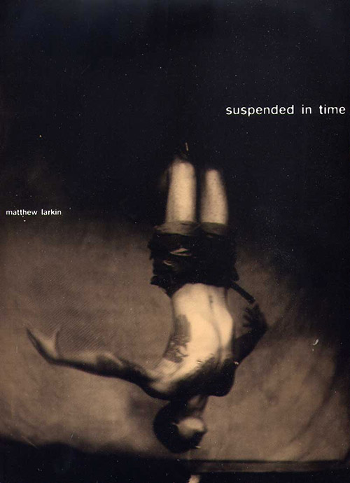
Cover of collodion photography Suspended in Time by Matthew Larkin (Black Barn Editions)

I recently stopped by wet plate collodion photographer Matthew Larkin’s studio and got a look at an advance copy of his just-published book, Suspended in Time, which is the end result of a two year collaboration between Larkin and body suspension group Rites of Passage.

I’m a bit of a hard sell when it comes to photography books. Not only had the images better be damn good, but it had better be printed well, form a coherent body of work, and the pictures mustn’t give everything up at once, they’ve got to be engaging and give me something to explore over time. A book I can flip through once and say, "that was good, but I got it, and I don’t necessarily need to see it again," isn’t getting my money or sustained attention. Suspended in Time delivers on all fronts, which is why it gets my vote and my cash. The photography—the subject of which will undoubtedly be truly challenging for some—is compelling and well edited, and the book itself is gorgeously designed by Binocular and impeccably printed by top-of-the-heap fine art printers Studley Press.

In the 15 or so years I’ve been doing print design professionally, I’ve developed an annoyingly critical eye that sees the slightest printing defect coming a mile away. Usually, offset printing is a frustrating guessing game, where getting the expected result is difficult, expensive, and rare, because it’s an analog, mechanical process where a lot can go wrong. Larkin and the designers were on press for a week working with the printers to get the duotone inks and varnish balanced just right. The result is nothing short of phenomenal; this is one of the best- and most interestingly-printed things I’ve ever seen.

What does this mean for the photos? They managed to get much, much closer to the look of the original black glass ambrotypes than I thought was possible with offset printing. Due to the colored varnish, the page surfaces are half-way between matte and high-gloss. It’s a look that I ordinarily wouldn’t care for, but it happens to work perfectly for the material: some of the otherworldliness of the glass originals is of course lost on paper, but the finish makes up for it, albeit in a slightly different, though no less effective, direction.

There are few cues about when the photos were made, which makes them difficult to nail down. They’re equally believable at 1 or 150 years old. The printing makes them look both immediate and anachronistic, with none of the sense of temporal distance that usually comes with old photos. Time-wise, they pick you up and throw you, but don’t let you see where you landed. It’s a neat trick that sets the stage for beginning the real work of digesting the content.

I think you should really have your own experience of the photos, so I’m not going to say anything more about the subjects. I do suggest going for the ride, though, and looking at and thinking about what comes up for you when you look at them. It’s probably going to be a challenge, but I think it’s a worthy one. There are a lot of interesting questions to be found here if you let them in. If you’d like to get a peek, there are several plates from the book here at the publisher’s site and in this previous post here on Photon Detector.

Given the material, the photographic process, and the fact that this is the first book of its kind, Larkin had an opportunity to write a Weston daybook-style flowery and self-congratulatory bit of wankery for the introduction. I’m quite pleased to report that he didn’t take it. Instead, he provides enough background to help you understand what you’re looking at, but stops before boring you or turning it into a public masturbation session, and lets the work speak for itself. A successful artist statement is a rare treat. Thanks for that.

Don’t let the fact that I know Larkin detract from this statement in any way: this book is incredible. It’s a unique piece that I know I’ll get a lot of exploration out of for a long time to come. I almost tried to come up with something bad to say so this seems more balanced, but I’ve got nothing. (For the record, I don’t accept free or discounted stuff from anyone I write about here. I saw the book, I like it, and I’m paying full price.)

You can order direct from the publisher, Black Barn Editions. The book is US $70 plus shipping, and express and international shipping are available.

Look for interviews with Larkin and several of the subjects in the coming weeks.


Clothbound with jacket, 9.25 × 11.5 inches
70 duotone illustrations in 144 pages

Edition limited to 2000, of which 100 are signed and numbered by the artist.

ISBN 978-0-9793352-0-4
US $70.00


More coverage
Review by NYC.com

Review by Phil Nesmith


Cover image © copyright 2007 Black Barn Editions. Used with permission.