Thoughts on an untitled photo by Brett Harrington

Untitled by Brett Harrington

Brett Harrington posted this on Flickr a few days ago. After I gave it a minute to sink in, I was all

This is another one of those "everything" images… it’s real and abstract, distant and in your face, cold and inviting. But I think it defies that kind of analysis because almost every observation I can make about it is both true and false. It’s like Schrödinger‘s photo, only you never get to open the box. That whole way of trying to explain or look is totally broken for this, so I can just cast it off to the side and forget it. That in and of itself is both amazing and rare, but after that, it’s still got me by the neck. It hasn’t slid into "well I just don’t get it or know what to make of it then" territory. After all that it’s still relevant, personal, and in an interesting and good way, invasive. But the way in which it is those things is beyond my ability to understand in concrete terms, so you’ll have to make do with "I really, really like this".

and he was all

…this is one of those shots that I don’t know why I like it, but I know I really do. It’s also one of those shots that reminds me of my taste in art. If you could search my deleted tags you would see I was about to tag it, "maybe just for me" due to the punches from nowhere it was giving me. I will stop there, knowing that you have already worded it better than I will if I keep going. I think it’s one of the best shots I have taken in awhile and I am very damn pleased that it has you by the neck.

and it was you know, like, cool and stuff. A week later and it’s still as captivating and description-defying as it was the first time.

Unsolicited critique: (Untitled) by Brett Harrington

This is part of a series of unsolicited photo critiques—see introduction.

This untitled photograph is by Brett Harrington (aka S.McKay). This isn’t really a critique or a commentary, because anything I could say about this image would start to define it according to my point of view, and to define it would be to fuck it up. Rather, this is an invitation to look into something else and see something of yourself: what do you see and feel? What does that tell you about your current state, right here and now? Are you willing to truly engage with an image like this? What does that tell you? Have at it.

(Untitled) by Brett Harrington

Unsolicited critique: Jessica, Tomsu Cleaners by Dan Loflin

This is the first in a series of unsolicited photo critiques (see introduction).

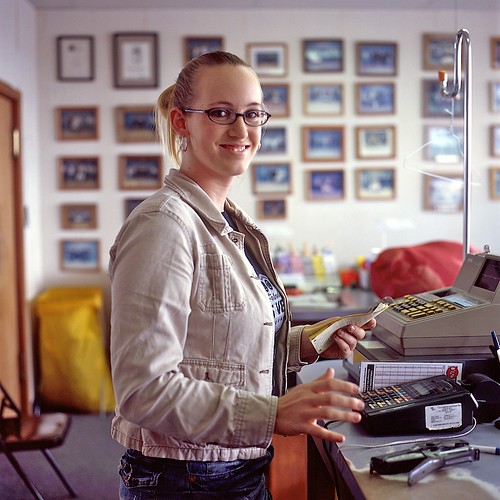
This photo, Jessica, Tomsu Cleaners, is by Dan Loflin. I love this guy’s work, and he’s made heaps of other interesting images, but this is a recent one that grabbed me.

Take a good, long look. This one’s better if you let it unfold yourself.

Jessica, Tomsu Cleaners by Dan Loflin

(Paraphrasing and expanding on the comment I left on the photo on Flickr:)

What I love about this is that it’s creeper weird. I look at it for a while. I see a pretty normal-looking scene, though it’s something you’re more likely to see in person rather than in a photo.

Great lighting.

There’s something a little uncomfortable about the framing. My eye wants to see the camera moved a bit to the right to eliminate the door frame and include the rest of the cash register. Then I’m glad he didn’t do that, because the subtle tension makes it feels like a real, active space that forces me to take in the whole thing rather than allowing me to snap to an immediate and pat parsing of "woman, cash register", making a bunch of assumptions, and walking away.

Great depth of field choice, it really complements the framing by letting each the foreground and background play their parts.

Then it starts to dawn on me: there’s an undercurrent here, a vaguely unsettling but quickly growing feeling. Then it’s a frying pan to the face. I really see her hands for the first time. They’re acting out their own fitful play while the rest of her is trying to go about her business. She seems interrupted, good-humored and maybe a little self-conscious, but her hands seem undeterred. It seems like Loflin’s given us a window into a long continuum of conflict and looks like a disturbingly precise portrait of functional OCD.

To me, this is a very understated but incredibly powerful decisive moment. It’s not necessarily immediately accessible—it wasn’t to me, anyway—but I think that’s part of this photo’s strength. I like art that makes me work for it a little and participate.

In music, there’s the concept of an "envelope", which describes the shape of a sound, and is broken into four components: attack (how quickly a sound reaches its full volume), decay (how much quieter it gets over how long a period), sustain (how long that quieter bit maintains a plateau level), and release (how quickly it fades out). The same applies to flavors in cooking and the emotional experience of looking at art for me. Not something to be quantitatively evaluated and used to judge work, but I’ve found it to be a useful framework for describing the rides, or plot arcs, that these things take me on.

Some photos, mostly those that rely on an effect over actual substance, give it all up too quickly. OK, you cross processed it, shot it with a pinhole or a Lomo, have a really shallow or huge depth of field, have a great tonal range, made a cyanotype, whatever, it makes an immediate and striking impression. But if you’re not saying or creating anything with that stuff beyond the effect, you’ve got nothing left after half a second. It grabs your attention but then doesn’t do anything with it. This is why de-fatted foods taste like shit: fat masks flavor and spreads its release out over a longer period of time. Without the fat, all the flavor compounds are released and processed right at the beginning, giving you a fast initial hit but leaving you a mouthful of tasteless crap to deal with.

There’s no flavorless crap in this photo. It draws me in with good compositional decisions, hintingly unfolds a little, ramps up quickly, punches me in the face, lets me hang out for a minute to put it all together, and then fades out, like having your head inside a struck bell that never quite stops vibrating. Chewing satisfaction goes on and on.

You can see more of Dan’s work at his Web site, DanLoflin.com, and in his photostream on Flickr.

New "feature": unsolicited photo critiques

I’m starting a new "feature" here on Photon Detector: unsolicited photo critiques. Generally, they’ll be of photos that I think work really well. Hopefully I’ll be able to articulate, at least to some degree, what’s successful about them to me, though I may put up the occasional "damn, check this shit out!" just because it’s awesome.

Disclaimers and notes

  • Most photos will be from Flickr, whose Terms of Use allow images there to be posted on other sites as long as they link back to the photo’s page on Flickr. Point five under "General Conditions" says:

    The Flickr service makes it possible to post images hosted on Flickr to outside websites. This use is accepted (and even encouraged!). However, pages on other websites which display images hosted on flickr.com must provide a link back to Flickr from each photo to its photo page on Flickr.

    When posting images not coming from Flickr, I will get the photographer’s permission in advance. I’ll try for Flickr images, too, but if I don’t, just know that I’m not being evil; those are the terms we agree to when we upload work there. I "we" because I have my own stuff there, too, which is of course subject to the same conditions.

  • This is all completely subjective—just one person’s opinion at a particular point in time. I may be wrong. I may change my mind at any time. I may still be wrong. You get the idea.
  • It’s about the result, not the process. The process is for the photographer, not the viewer. I don’t see "cheating" with Photoshop as a negative or "keeping it real" by coating your own plates as a positive. Likewise, no points added for Leica and none taken away for a webcam. I’m not a purist and I don’t care how you got there. What works for the image works for the image, and what doesn’t, doesn’t.

    The only caveat is that if a technique breaks the spell with its heavy-handedness, it usually detracts from my experience of the photo.

  • If I do say something negative, I’m genuinely trying to be constructive. I’m also not saying that I could do better.
  • If you think I’m not sticking to this, please bust me on it!
  • Remember that I have no idea what the photographer was aiming for when making the image, I only know what I see.
  • When I look at engaging photos, I have a tendency to go into a kind of borderline fugue state, step into the image as best as I can, and see where it takes me. Some of my comments will undoubtedly make more sense if you try to do the same, or at least know that going in.
  • If you leave a comment—and I hope that you do!—play nice. Let’s not turn this into Michael Johnston’s Great Photographers on the Internet. Be constructive and helpful. If you must attack something, attack ideas, not people. Remeber that liking something and recognizing is as effective are completely different things. I will leave comments that are respectful alone, even if they’re not flattering, and will delete any that I deem assholic.

Check out the first critique: Jessica, Tomsu Cleaners by Dan Loflin