Check out this review of the Holga WPC (Wide Pinhole Camera) at HolgaBlog.
Related: Holga WPC group on Flickr
Check out this review of the Holga WPC (Wide Pinhole Camera) at HolgaBlog.
Related: Holga WPC group on Flickr
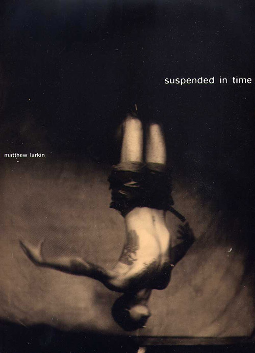
I recently stopped by wet plate collodion photographer Matthew Larkin’s studio and got a look at an advance copy of his just-published book, Suspended in Time, which is the end result of a two year collaboration between Larkin and body suspension group Rites of Passage.
I’m a bit of a hard sell when it comes to photography books. Not only had the images better be damn good, but it had better be printed well, form a coherent body of work, and the pictures mustn’t give everything up at once, they’ve got to be engaging and give me something to explore over time. A book I can flip through once and say, "that was good, but I got it, and I don’t necessarily need to see it again," isn’t getting my money or sustained attention. Suspended in Time delivers on all fronts, which is why it gets my vote and my cash. The photography—the subject of which will undoubtedly be truly challenging for some—is compelling and well edited, and the book itself is gorgeously designed by Binocular and impeccably printed by top-of-the-heap fine art printers Studley Press.
In the 15 or so years I’ve been doing print design professionally, I’ve developed an annoyingly critical eye that sees the slightest printing defect coming a mile away. Usually, offset printing is a frustrating guessing game, where getting the expected result is difficult, expensive, and rare, because it’s an analog, mechanical process where a lot can go wrong. Larkin and the designers were on press for a week working with the printers to get the duotone inks and varnish balanced just right. The result is nothing short of phenomenal; this is one of the best- and most interestingly-printed things I’ve ever seen.
What does this mean for the photos? They managed to get much, much closer to the look of the original black glass ambrotypes than I thought was possible with offset printing. Due to the colored varnish, the page surfaces are half-way between matte and high-gloss. It’s a look that I ordinarily wouldn’t care for, but it happens to work perfectly for the material: some of the otherworldliness of the glass originals is of course lost on paper, but the finish makes up for it, albeit in a slightly different, though no less effective, direction.
There are few cues about when the photos were made, which makes them difficult to nail down. They’re equally believable at 1 or 150 years old. The printing makes them look both immediate and anachronistic, with none of the sense of temporal distance that usually comes with old photos. Time-wise, they pick you up and throw you, but don’t let you see where you landed. It’s a neat trick that sets the stage for beginning the real work of digesting the content.
I think you should really have your own experience of the photos, so I’m not going to say anything more about the subjects. I do suggest going for the ride, though, and looking at and thinking about what comes up for you when you look at them. It’s probably going to be a challenge, but I think it’s a worthy one. There are a lot of interesting questions to be found here if you let them in. If you’d like to get a peek, there are several plates from the book here at the publisher’s site and in this previous post here on Photon Detector.
Given the material, the photographic process, and the fact that this is the first book of its kind, Larkin had an opportunity to write a Weston daybook-style flowery and self-congratulatory bit of wankery for the introduction. I’m quite pleased to report that he didn’t take it. Instead, he provides enough background to help you understand what you’re looking at, but stops before boring you or turning it into a public masturbation session, and lets the work speak for itself. A successful artist statement is a rare treat. Thanks for that.
Don’t let the fact that I know Larkin detract from this statement in any way: this book is incredible. It’s a unique piece that I know I’ll get a lot of exploration out of for a long time to come. I almost tried to come up with something bad to say so this seems more balanced, but I’ve got nothing. (For the record, I don’t accept free or discounted stuff from anyone I write about here. I saw the book, I like it, and I’m paying full price.)
You can order direct from the publisher, Black Barn Editions. The book is US $70 plus shipping, and express and international shipping are available.
Look for interviews with Larkin and several of the subjects in the coming weeks.
Clothbound with jacket, 9.25 × 11.5 inches
70 duotone illustrations in 144 pages
Edition limited to 2000, of which 100 are signed and numbered by the artist.
ISBN 978-0-9793352-0-4
US $70.00
More coverage
Review by NYC.com
Cover image © copyright 2007 Black Barn Editions. Used with permission.
Now the Canon EF 50mm f/1.2 L USM Lens enters the market. Being a prime Canon L Series Lens, the Canon 50 f/1.2 far exceeds all existing Canon 50mm lenses in nearly all aspects – including three negative ones: size, weight and price. Since Canon already has a 50mm f/1.4 lens, they would not release a slightly wider aperture version at a far higher price, size and weight without offering significantly better features and image quality. Otherwise, people simply would not buy the lens. The question is – are the actual differences enough?
Continue reading at The Digital Picture
Via PhotographyBLOG
Tread wrote a nice review of the documentary film about photographer William Eggleston, William Eggleston In the Real World. Eggleston, having been the first to gain recognition for presenting colour photographs of the mundane as art, is often credited as "the first photoblogger".
Read Tread’s review at his photoblog, gotreadgo.
Photographer Joe Reifer wrote a nice review of the new Lensbaby G3 selective focus SLR lens. Check it out at The Online Photographer.
The introduction of new papers from Hahnemuhle, Innova, and Museo have everyone scrambling for these papers, as they are suppose to be the reason to finally come out of the darkroom. After all, B&W silver gelatin paper manufacturers are starting to disappear, causing more artists/photographers to convert to digital printing methods. This does not mean that we should start expecting these paper companies to create exact replicas of our favorite silver gelatin papers. We as a community, need to start suggesting what we would like them to change about their current papers rather than asking them to match paper that is oriented to a completely different process. These three papers are derived from exactly that, all three companies listened to the cries of those tired of RC semi-gloss or luster papers. The papers they produced are a tremendous accomplishment for the first generation of a new product, remember these papers are first generation.
…
I personally along with many other photographers have refused to print on so-called luster or semi-gloss papers due to their look. The next generation of paper’s large color gamut and DMax allows for a higher color saturation, which produces a look that creates images that have a similar image quality and feel as traditional photographic paper. These three papers are nothing like any paper I have ever used, digital or traditional, because they have their own image qualities. We finally have the technical tools, to create the imagery that we all have been waiting for with the advent of these papers.
Continue reading at Booksmart Studio
Michael Reichmann at The Luminous Landscape has just posted a review of Canon’s new iPF5000 inkjet printer. This is of partcicluar interest because Epson has been the only game in town for fine art photographic printing until this March, when Canon and HP both announced their own offerings at this years PMA trade show. Now that there’s some competition, let’s see how they stack up!
Reichmann writes:
In May, 2006 Canon began shipping the iPF5000 printer. This is a 12 ink, pigment-based, 17″ carriage photographic printer capable of printing in 16 bit mode. It is physically large, moderately priced (for what it does), and, as will be seen, surpasses just about every other fine-art inkjet printer yet available, in terms of both image quality and convenience of features.
This review is based on three weeks of almost daily use of the iPF5000. By way of background, over the past 10 years I have been using a range of Epson printers, including, most recently, the Pro 5500, 4000, and 4800 models. These, especially the current Epson Pro 4800 model, will be my points of comparison.
Continue reading at The Luminous Landscape
The lens performed well across its range, particularly in terms of corner sharpness at wide angle, while essentially matching our EF 85mm f1.8 prime in terms of resolving power. We were also impressed with the Image Stabilisation which allowed us to handhold at much slower shutter speeds than normal. Compared to lenses designed for bodies with smaller sensors though, it suffered from a worse degree of light fall-off, but this is par for the course for wide-angle lenses designed for full-frame bodies.
There’s an effective demonstration of Canon’s IS (Image Stabilisation) handheld at 1/13 second, too. (The shit works!)
Read review at Camera Labs
Via PhotographyBLOG
See also: Bill Caulfeild-Browne’s A Comparison of the new Canon 24-105 mm f4 L IS lens with the Canon 24-70 mm f2.8 L and Mark D. Segal’s How I Decided to Up-Grade From a Canon 28~135 IS to a Canon 24~105 F/4L IS at Luminous Landscape
It turns out that when I reviewed the HP Combi-Plan T 4×5 daylight sheet film developing tank and called it a "dodgy, leaky piece of shit", I may have vastly under-stated my case.
It was nice today: the trees in a local apple orchard were flowering, it was warm but not hot, and the light was good. I loaded up some Velvia and FP4, grabbed my field camera, and spent half an hour waiting for a cloud to move out of the way of the sun.
It’s been a while since I shot B&W 4×5 and I forgot that I never actually ordered the rotary tube I was looking at to replace the Combi-Plan. Oh well. You know how sometimes you have a bad experience with something, time passes, and you start to think that it couldn’t really be as bad as you remember? The Combi-Plan can’t be that bad, can it?
It can. Now that I’ve given the tank another go, I think it’s still dodgy, it’s still leaky, and still a piece of shit, but that doesn’t really begin to cover it. This time, most of the sheets escaped their carrier channels and were floating around loose inside. One sheet had a few chunks of emulsion scratched out, which could be my sometimes questionable film holder loading skills, but my money’s on it floating around and scraping against sharp film carrier parts.
I’m frankly amazed that this thing is actually sold. If I hacked something this bad together, I wouldn’t even lend it to a friend, let alone attempt to charge money for it. Either the company who make this have never used it or they’ve got balls the size of the moon. This product needs to be melted, dunked in piss, and stabbed in the face with a fucking schoolbus.
UPDATE: The scratches are my fault. I forgot to affix the thing that holds the film in place to the top of the film carrier.
Northlight Images have posted a comprehensive review of Canon’s 24mm tilt/shift lens, which allows a limited set of view camera-like movements for perspective and focus manipulation:
Keith recently obtained a Canon TS-E 24mm 3.5L lens primarily for interior and exterior photography of buildings. There are quite a few reviews of the TS-E 24mm on the web, but we wanted to give a bit more of a feel for what it is actually like to use a shift lens for real (on a Canon EOS 1Ds). Given the very wide angle pictures you can get with a 16mm lens and the ease of correcting perspective in Photoshop, why bother with this manual focus lens and all the extra effort involved in using it? This review/article is intended to give an overview of some of the effects, and has links to more detailed technical info at the end.
Read review at Northlight Images
Via Photography Blog